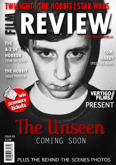
 | After completing a first draft for our film magazine cover (image to the left), our teachers and fellow pupils gave us useful feedback, including suggested improvements we could look at in order to make our poster look more professional and allow us to achieve a higher level of standard. Taking the responses on board, we made several alternations to the magazine cover. Improvements included: - change in photo as the same one was used in film poster in colour - decrease size in barcode - add sub-images that could relate to our film - include a tagline (use poster one) - add a magazine selling line, known as its USP After making these changes, we noticed how much more professional our magazine front cover looked and how it would attract our audience more as the overall design of the cover had improved. The re-arrangement of the features also allowed the main image of the child antagonist to be the central focus of the cover. Throughout our project, as a group, we placed a great value on the feedback we received from both our teachers and fellow pupils. 1ST DRAFT |